Hönger
AG
A Swiss manufacturer of micro-precision components — miniature roller tables, positioning stages, diopters and check valves. A complete website design in German and English.
The project
A catalogue
that has to
look precise
Hönger AG develops and produces high-precision micro roller tables in Roggwil, Switzerland. The range runs from linear guides a few millimetres wide to miniature check valves pressed into fluid channels.
The site had to do two jobs at once: convince a buyer that a company grinding to the thousandth is credible, and let an engineer who already knows his bore diameter reach the right part. The design answers both with the same components.
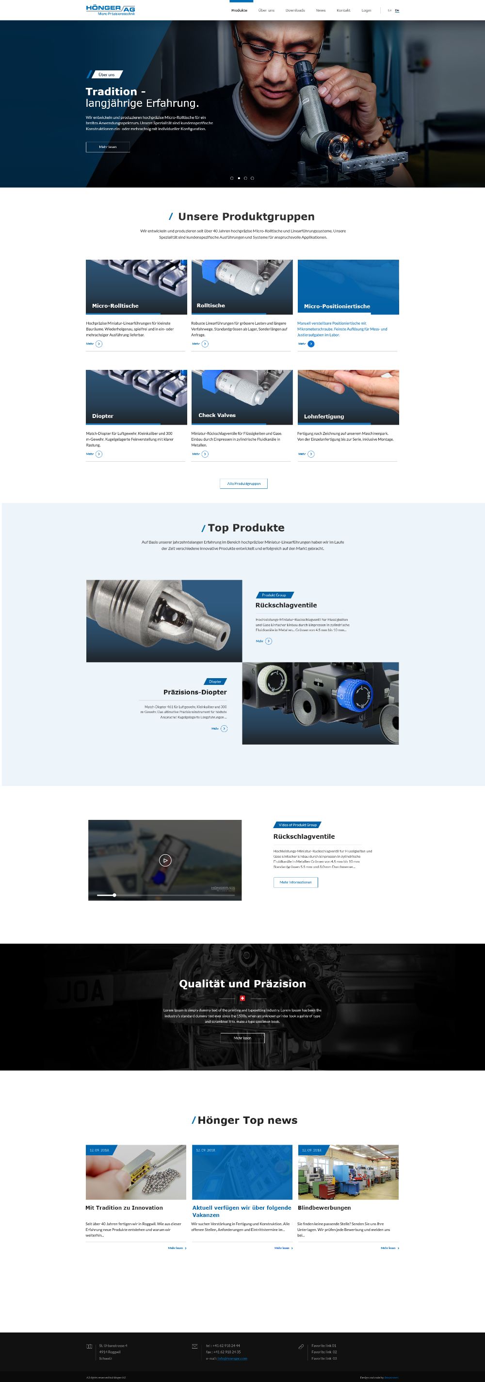
Homepage & banner system
Product list & product detail
News templates, components, icons
made in production
01 — The banner
Three pictures,
one promise
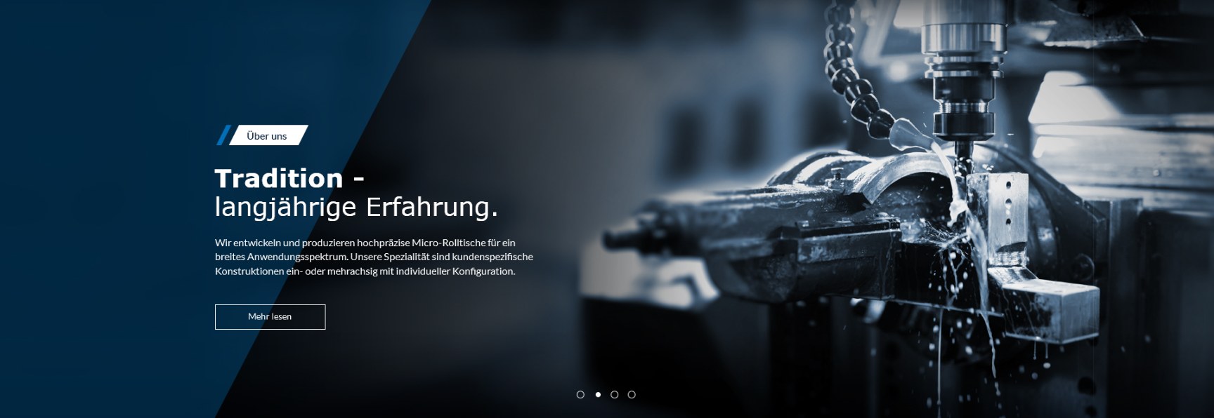
The slider is the company introducing itself. Three photographs of Hönger's own production put the visitor inside the workshop before a single product is named.
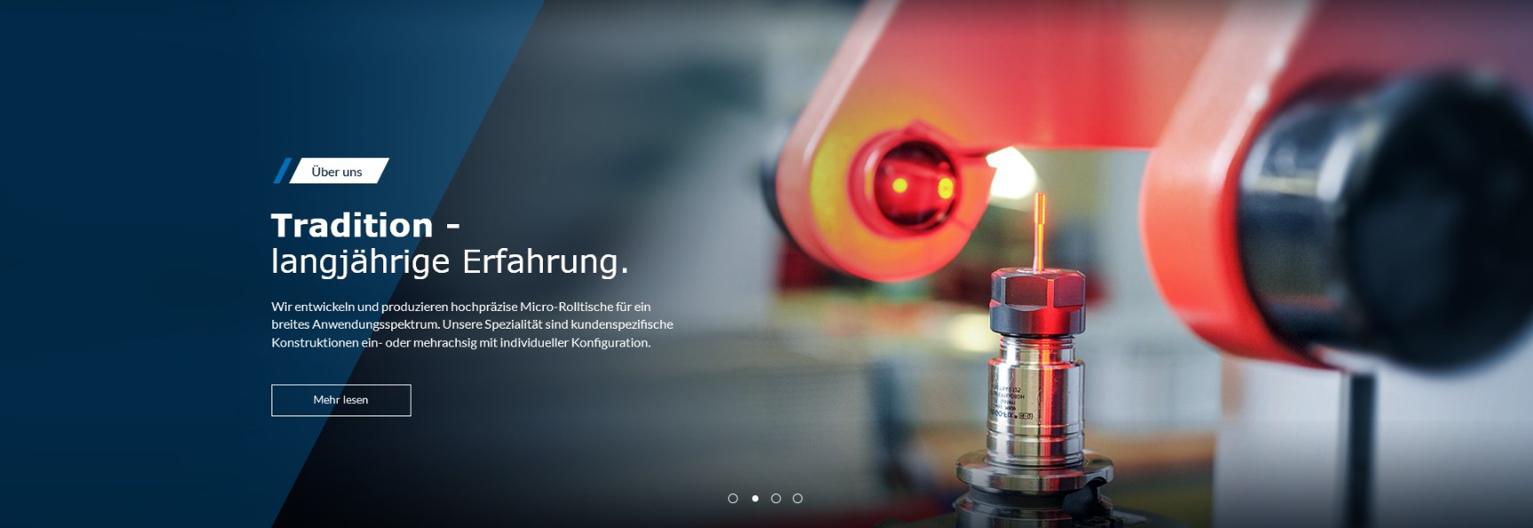
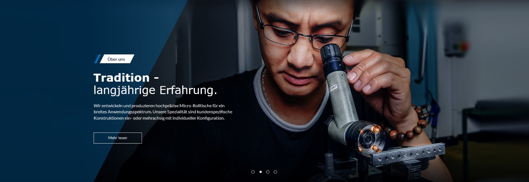
A cutter under coolant, a laser weld, an operator at the microscope. Precision and professionalism are easier to believe from the shop floor than from a sentence.
02 — Finding a family
The homepage,
one level down
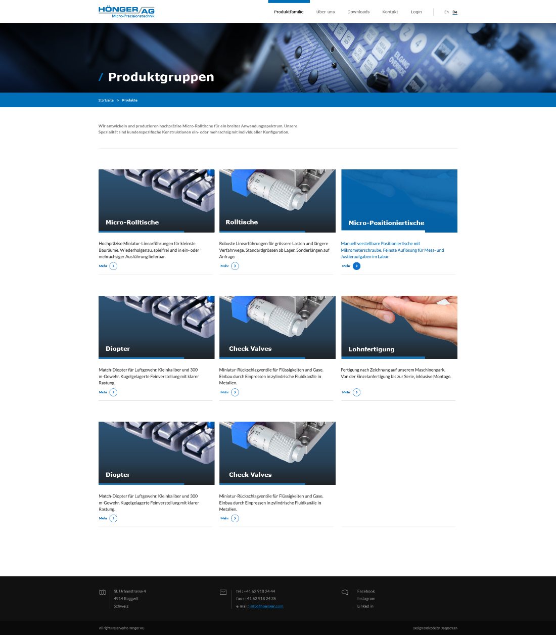
The list page keeps the look and feel of the homepage. The same photographic banner carries over from the slider, and the blue bar under it states where the visitor currently stands, so moving deeper into the site never feels like arriving somewhere else.
Below that the design gets out of the way. The whole range sits on one clean screen as equal cards, with no sub-levels to open, so the visitor finds what he came for straight away.
03 — The product page
Arguments
before numbers
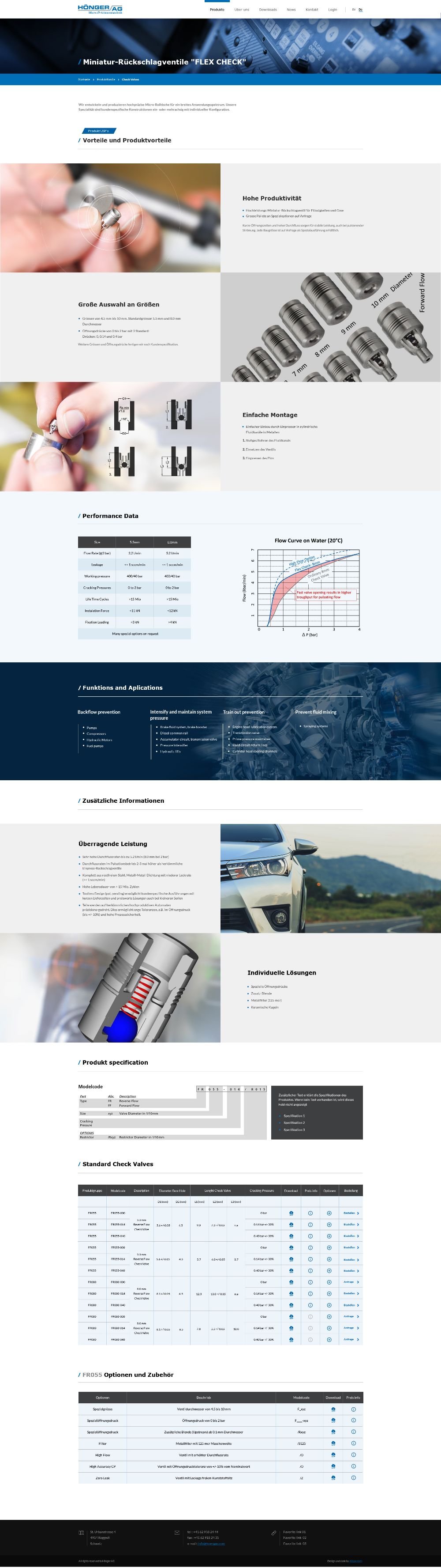
The page argues before it lists. Benefits come first, each one paired with a photograph cropped to a hand holding the part — the only way to give a five-millimetre valve a sense of scale.
Then the numbers, in the order the decision is made: performance data, applications by industry, the model code, and the variant tables where every row ends in a download and an order.
Five elements carry the whole site: the diagonal banner, the blue breadcrumb bar, the slash before a heading, the gradient card and the circled chevron. Everything else is photography and specification.
Hönger AG
UX & UI design