MAG is a PlayStation gaming lounge that rents out and sells game consoles.
To grow the business and expand into new markets, they wanted to improve their visual identity.
The approach to this project was to tear down
everything done so far and build a new identity from scratch.
Logo
Idea and execution
The idea behind the logo was to stylise the PS4 controller so that it reads as the letter “M”, and then to build the other two letters, “A” and “G”, out of that same shape.








Repetition
Tying the parts into one whole
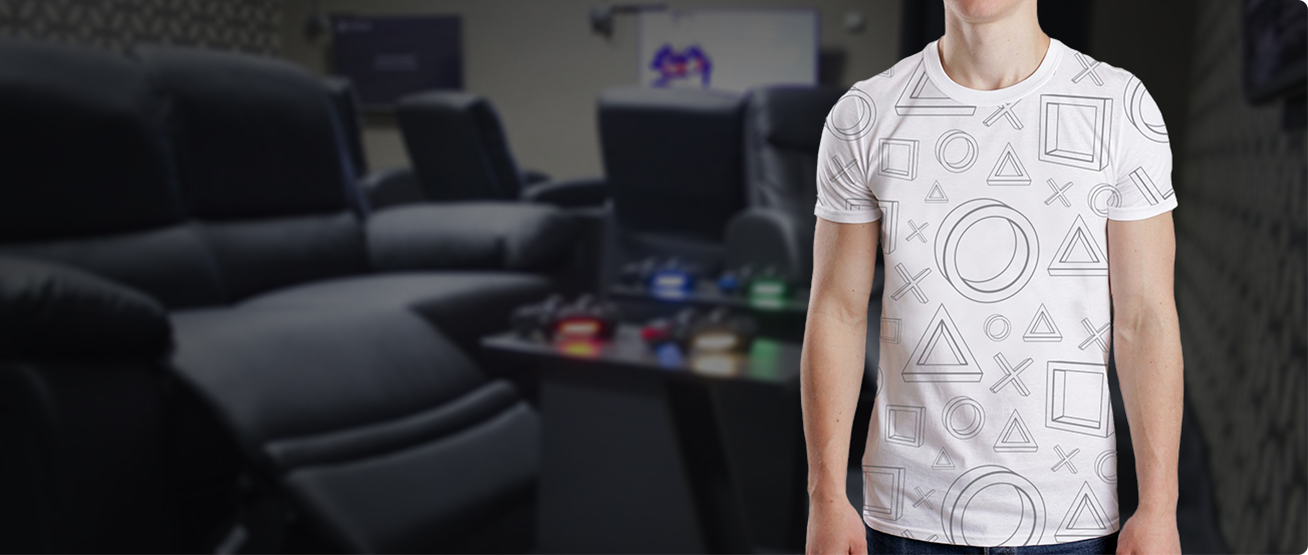
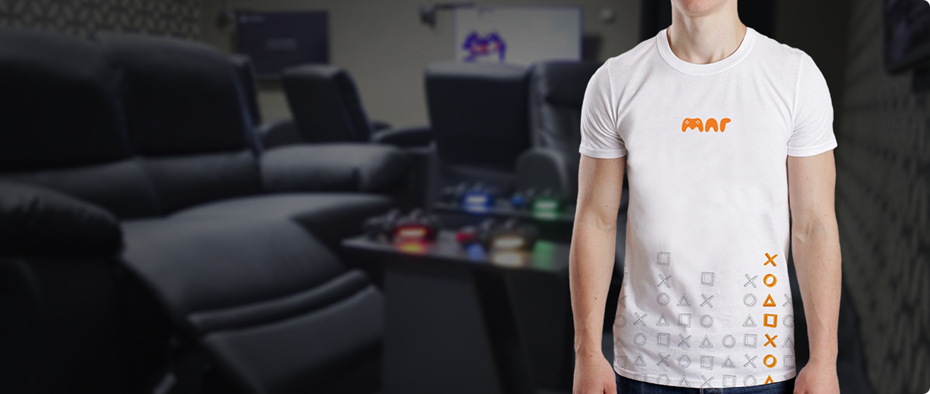
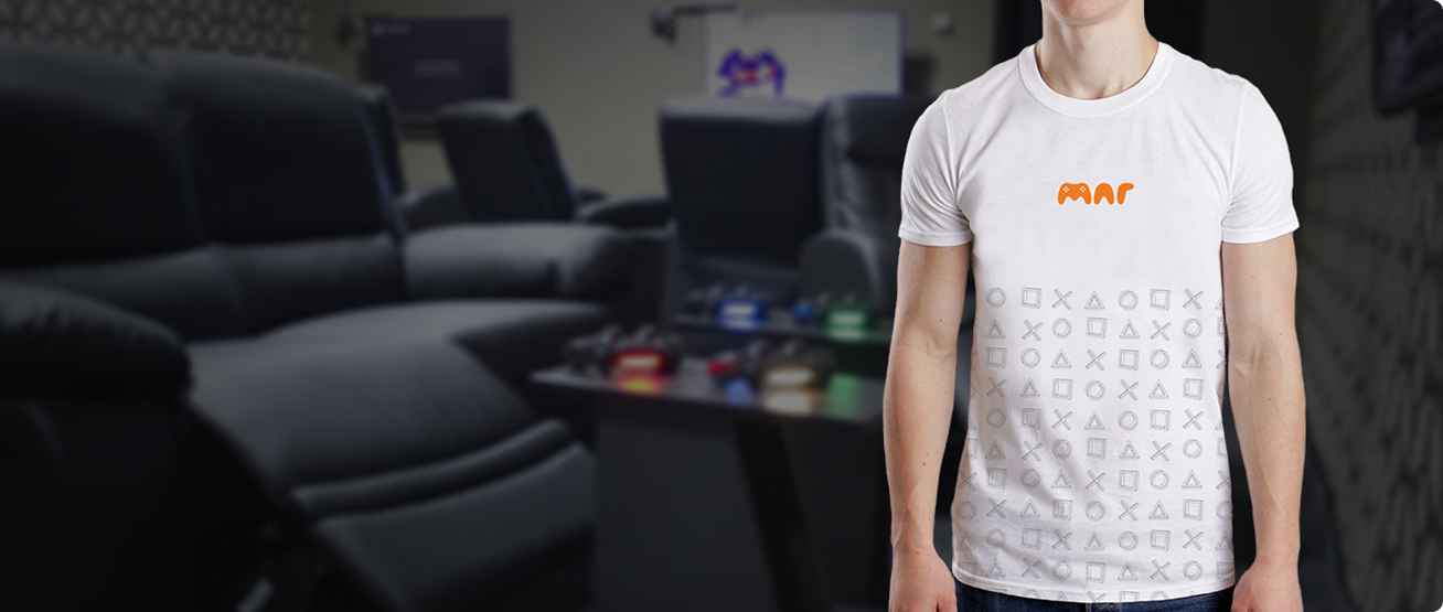
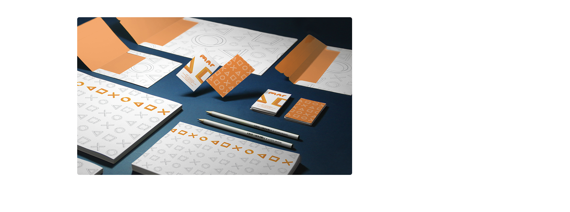
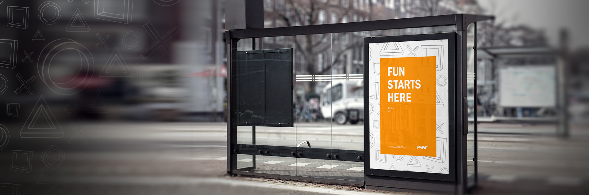
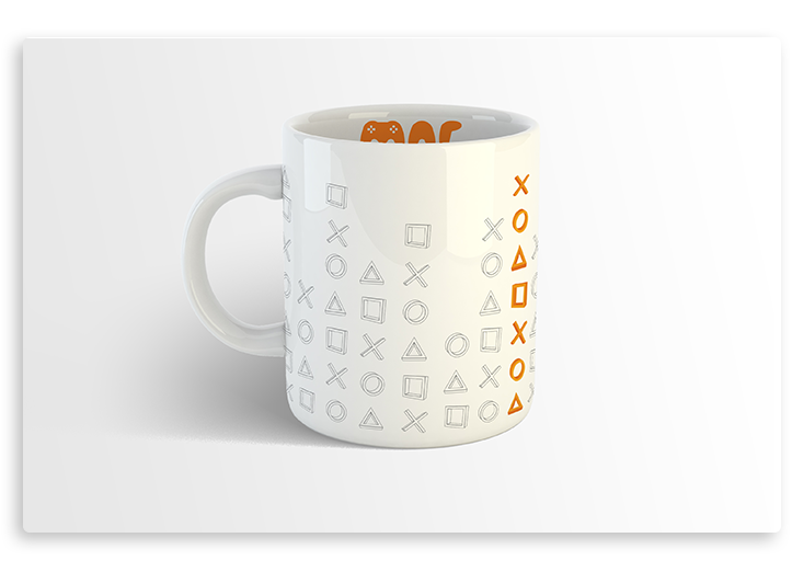
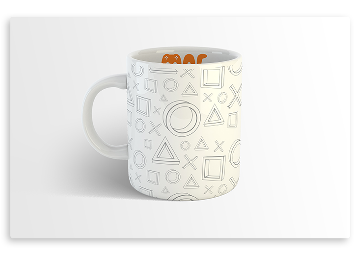
The graphic pattern uses the symbols found on the controller — triangle, square, circle and cross — because they are recognisable on any PlayStation console. Together with the logo, this pattern is what ties every part of the visual identity together.
Branding
Printed material

Printed material
The graphics built from the repeated symbols apply easily across marketing material. They make the products feel playful and distinctive while still being informative.