
Logo redesign
Mean Machine
Tattoo
A tattoo studio in Belgrade with a logo that had already been in use for several years — one I had designed myself. It was not tired and it was not badly drawn. It was built in a way that would not let anything else near it.
It served the studio well for years, but it had reached the point where a refresh was the right call.
Brand guidelines
Business cards
01 — The version before
Nothing could
stand next to it
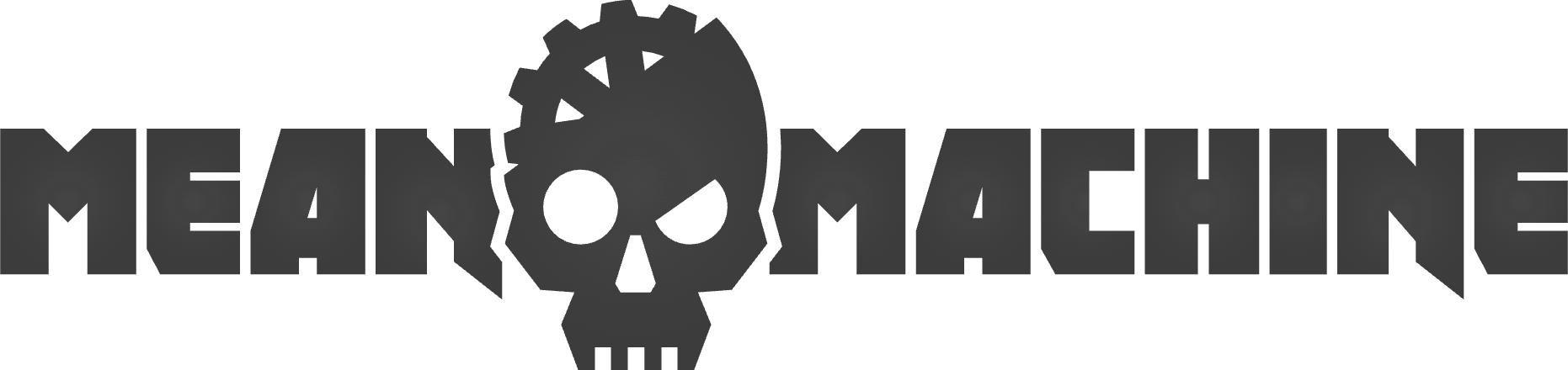
The reason is visible once you look for it. The skull is not sitting beside the name, it is wedged inside it — holding the gap between MEAN and MACHINE, doing structural work. Take the words away and the skull has nothing to stand on. Add a word and the whole line has to be rebuilt.
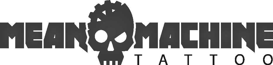 In use for several years
02 — The skull comes out
Lift it out,
give it a base
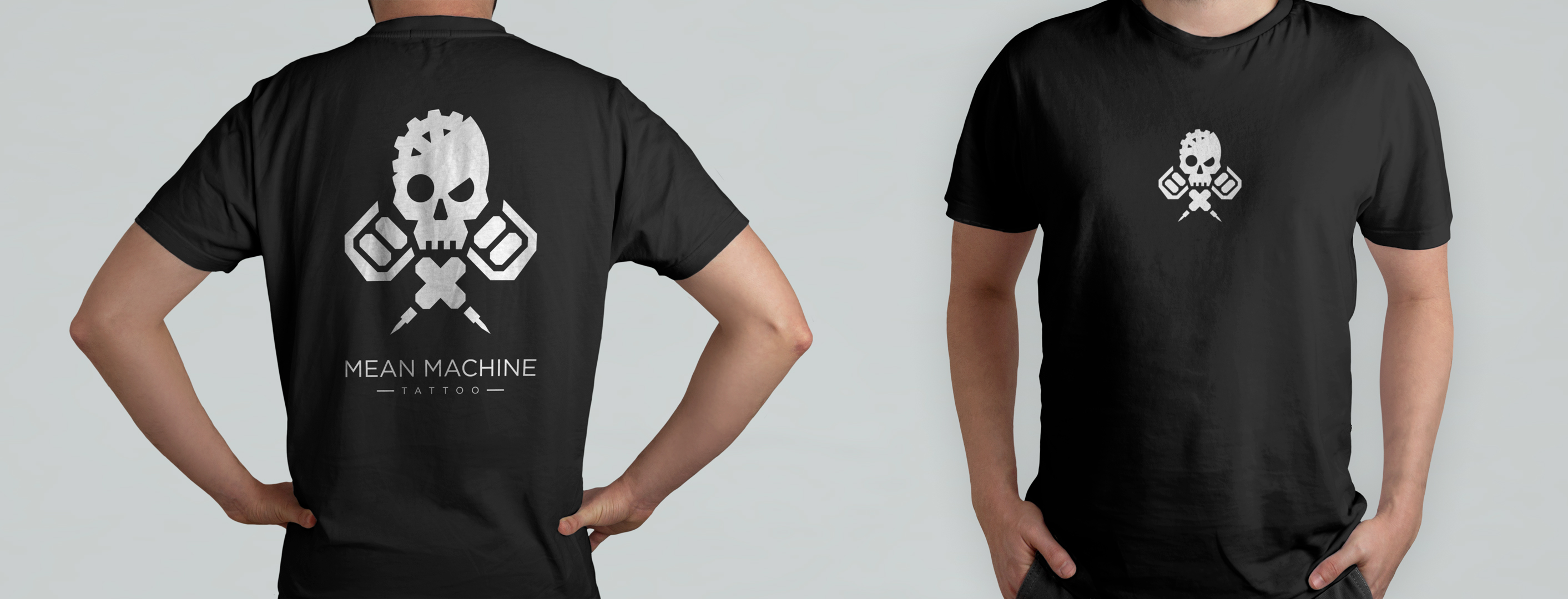
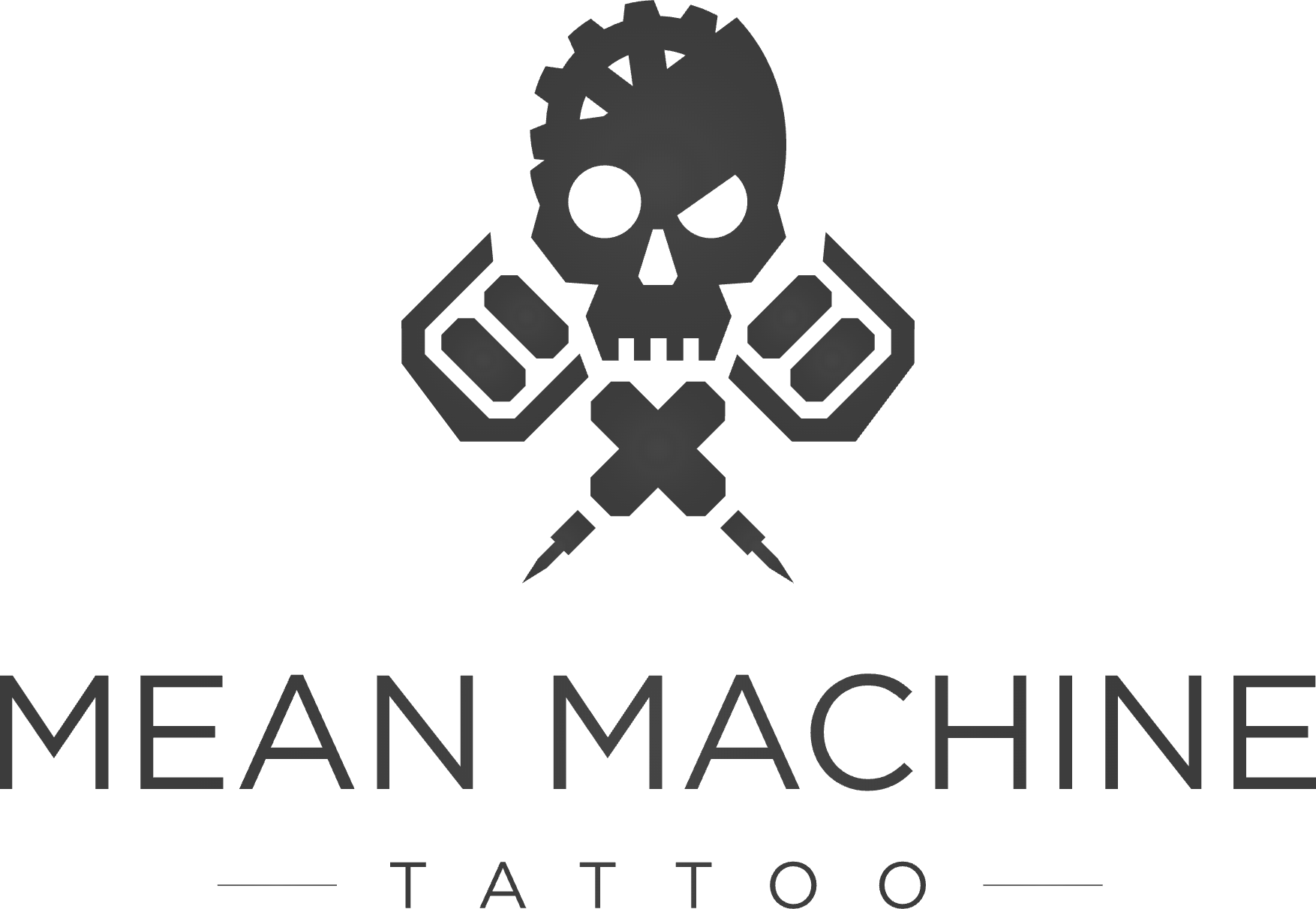
The skull came out of the wordmark and became the mark. Two tattoo machines now carry it, and the name sits below on its own.



03 — Alone, and together
Two pieces that
no longer need
each other
The emblem and the wordmark are now separable. Small on a chest, the skull alone is enough. Large across a back, the full lockup has room for the name. Neither version looks like a piece of the other one is missing.
04 — Business cards
Black on black,
gloss on matte
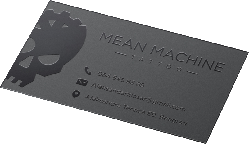
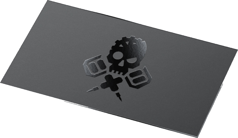
Spot UV on dark stock. Black on black reads as expensive, and slightly gothic — and the contact details still come off the card straight away, without hunting for the light.
In active use