Brand Identity · 2026
MP Lash
& Tan
A new lash and tanning studio in Stara Pazova, Serbia. It opened with nothing of its own — no logo, no colours, nothing printed. The brief was two things: her initials, M and P, and a brand that looked expensive.
Nothing to keep, nothing to carry over. The identity was drawn from zero: a monogram, a wordmark, a set of service icons, business cards and a printed price list.

01 — The Monogram
Two letters,
one mark
The M is cut back to its two diagonals. The right one stops just short of the P’s stem, close enough that the eye closes the gap and reads a single mark before it reads two initials.
Only the M’s left leg keeps its bracketed serif. The right stroke ends in a flat angled cut instead, which is what stops the mark from looking like a typeface and starts making it look like a signature.

02 — Lockups
One mark,
two jobs
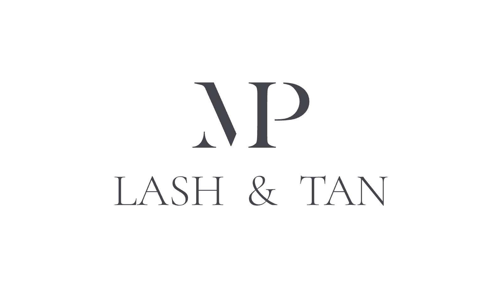
The full lockup sets the name in spaced capitals under the monogram, matched to its serif, and does the work anywhere the studio still has to introduce itself. The monogram goes alone where there is no room to explain: the profile picture, the front of the card, anything small.
03 — Service Icons
Drawn to
the same weight
Three treatments, none of them obvious from their names. Each got its own icon, drawn at the hairline weight of the logo’s thin strokes so the set belongs to the monogram rather than sitting next to it.
 Lash & brow lift
 Nadogradnja trepavica
 Spray tan
04 — Business Cards
Simple
and clear
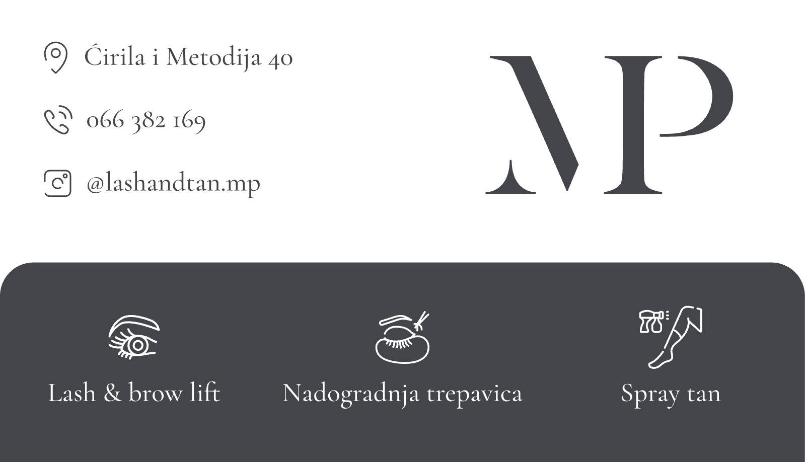
The front keeps the address, the phone number and the Instagram handle on the left, each with an outline icon at the same weight as the service set, and gives the rest of the space to the monogram.
A charcoal panel runs along the bottom edge with the three treatments and their icons, so the card answers what the studio does without a sentence of copy. The back is the full lockup, centred, nothing else.
05 — Price List
Elegant and
informative
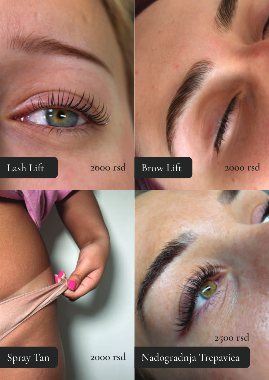
The flyer flips the palette: charcoal cover, cream lockup, contact details along the foot. The reverse gives each treatment a photograph and a price, with the same charcoal labels holding the two together.