OLI
Centar
A platform for a psychotherapy and coaching education centre that had been running everything on paper.
The project
Built for one
organisation only
OLI Centar trains psychotherapists, counsellors and coaches. Trainees move through modules in groups, across cities, over years. Educators teach them and collect their fees. Administrators are supposed to know where all of it stands.
None of it was software. It was paper.
Solving their problems meant understanding them first, so the design was made in near-daily conversation with their team rather than from a specification.
UX — flows and structure
Wireframes & prototype
UI design
Educator
Trainee
01 — Paper stopped scaling
Too many people
to keep in a
notebook
There were too many educators and trainees to keep following the schedule and the payments by hand, and harder still for anyone overseeing the centre to see the whole picture.
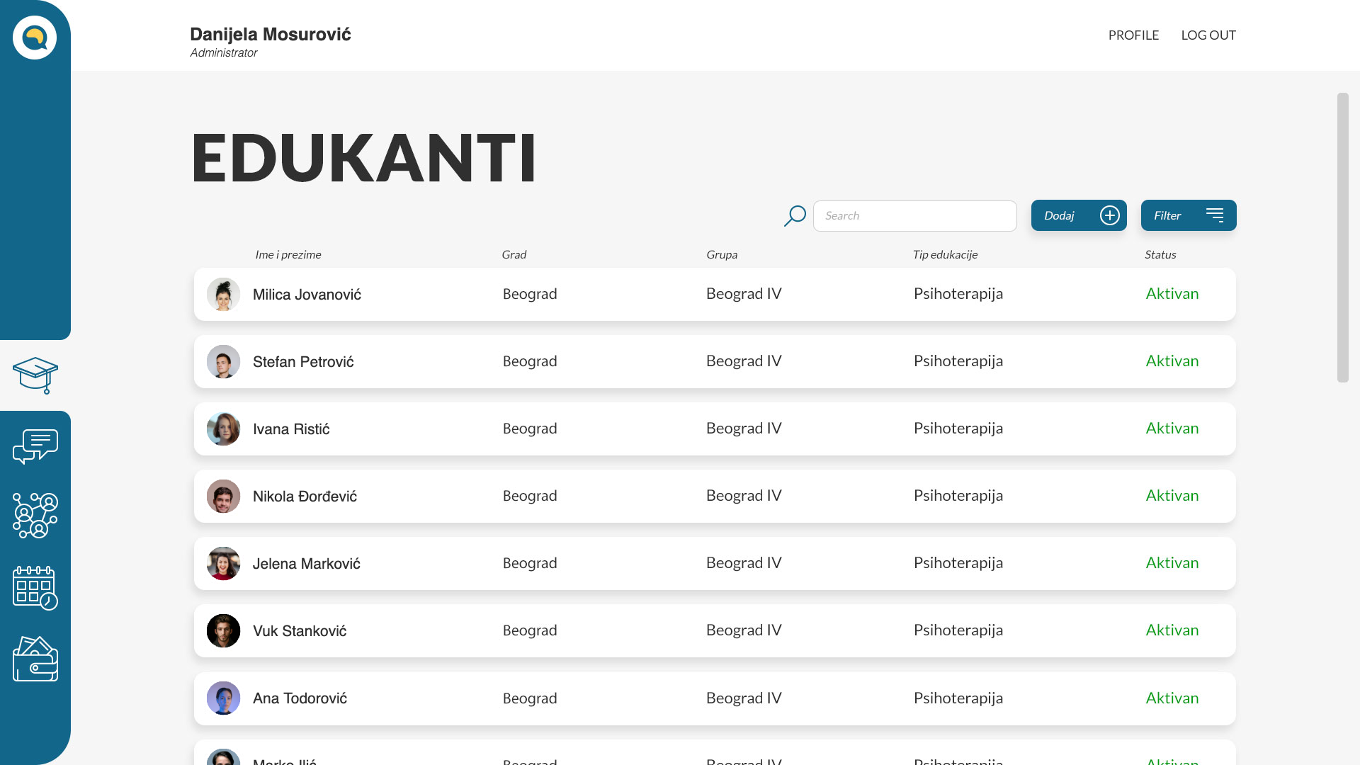
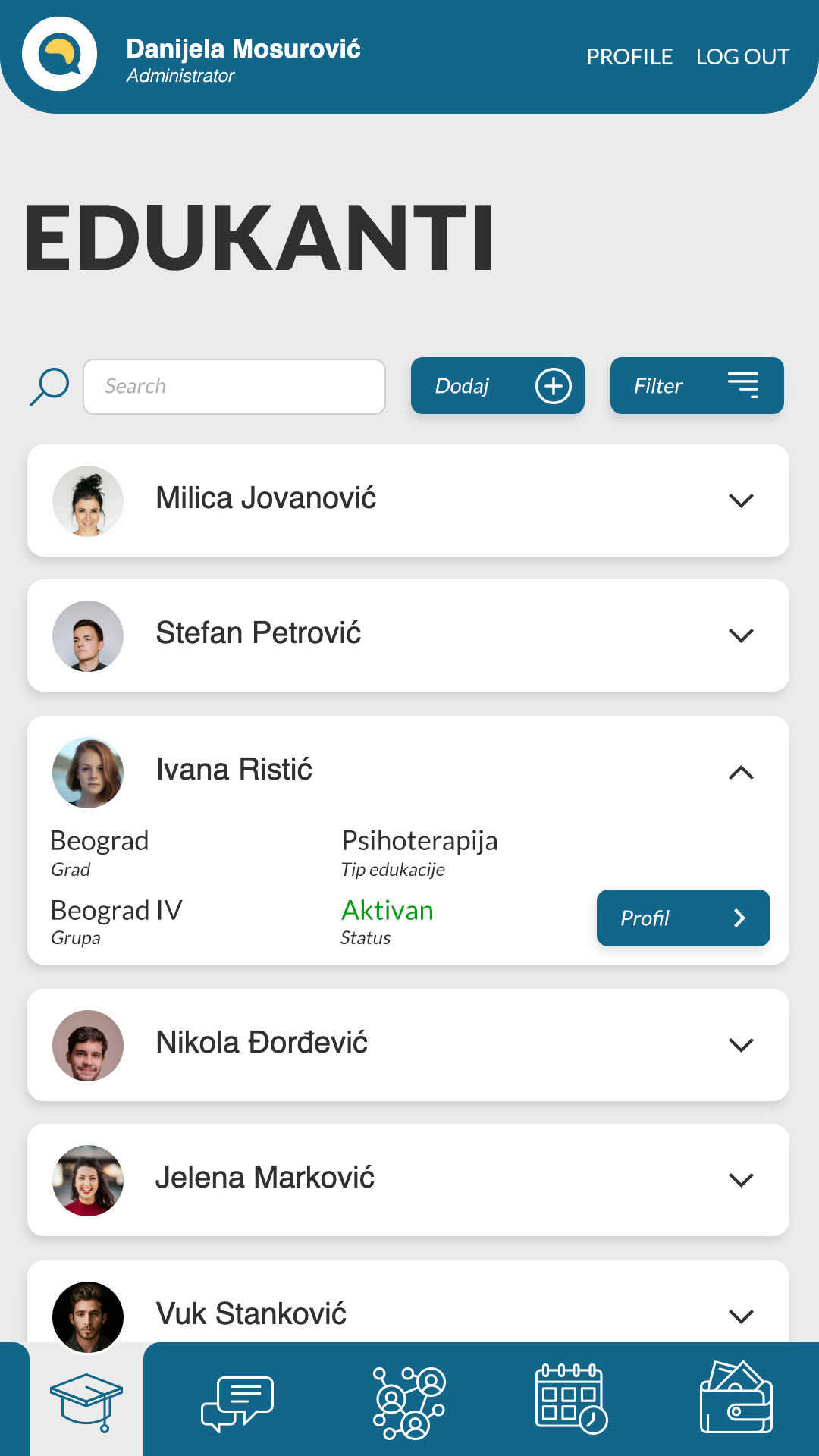
So the first job was unglamorous: give every kind of record one place and one shape. Trainees, educators, groups and the schedule are all built on the same row — search, filter, add — so an administrator learns the pattern once and it holds everywhere. Status sits at the end of every row, because that is the question always being asked.
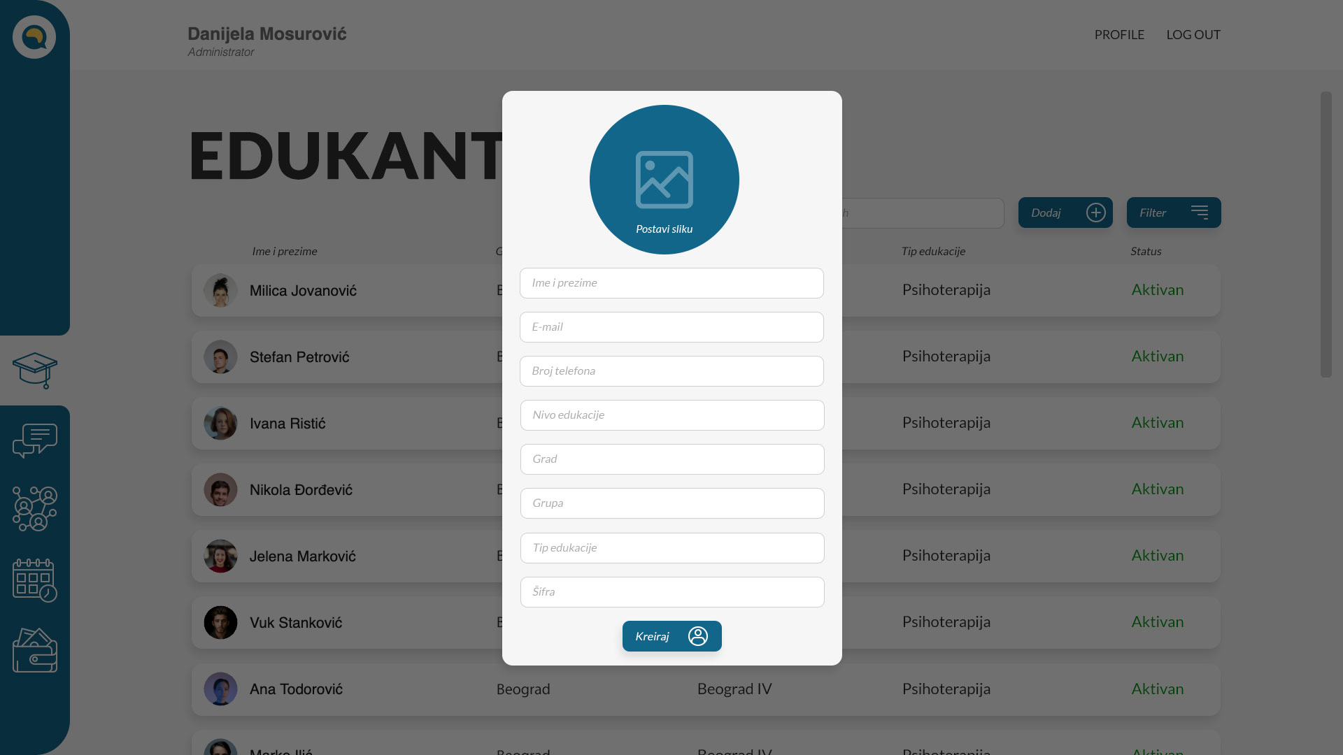 One form adds a trainee, their group, level and city
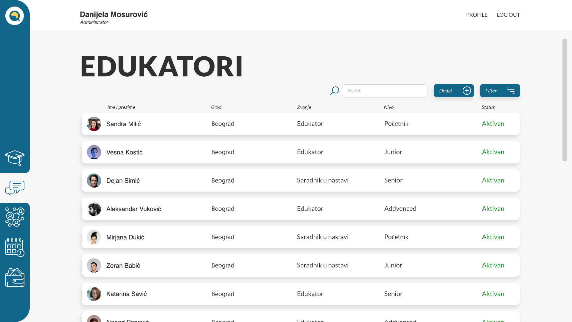 Educators — title and level
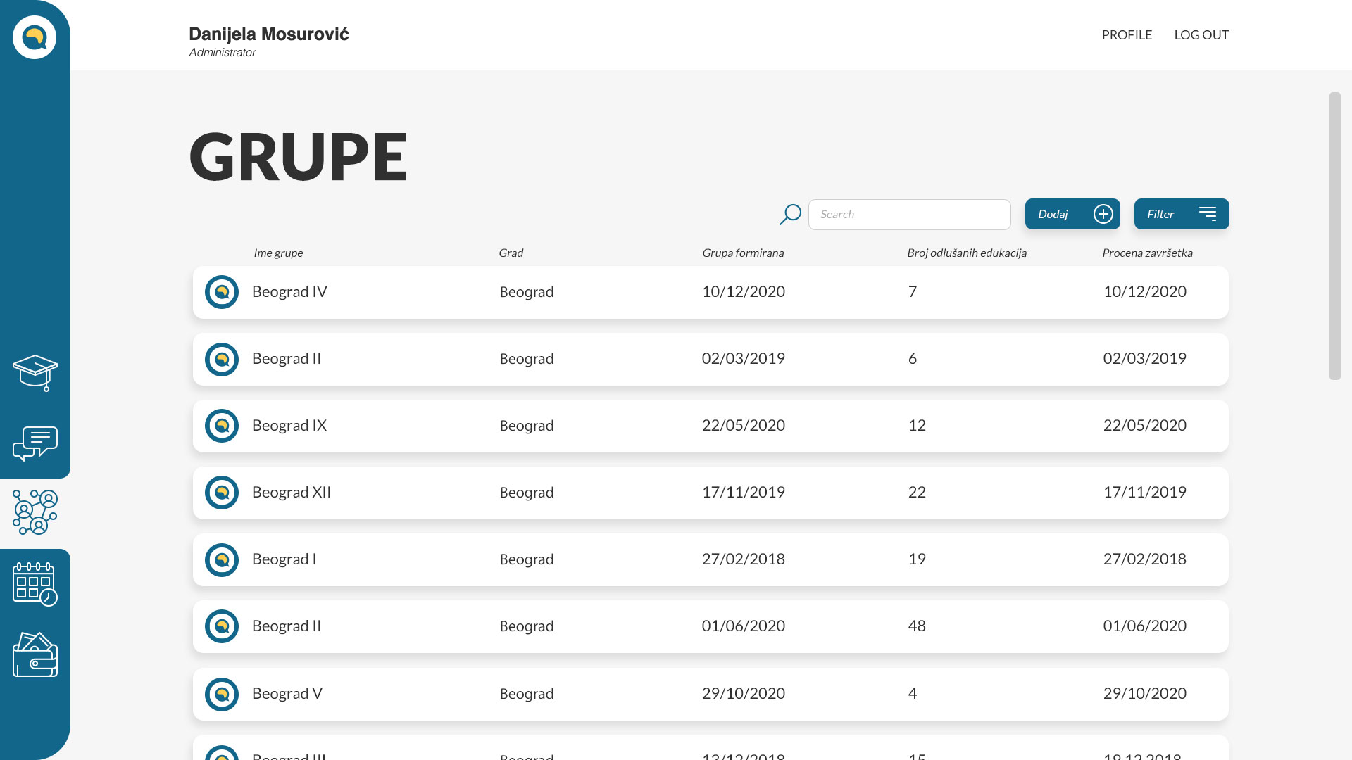 Groups — when formed, how far along
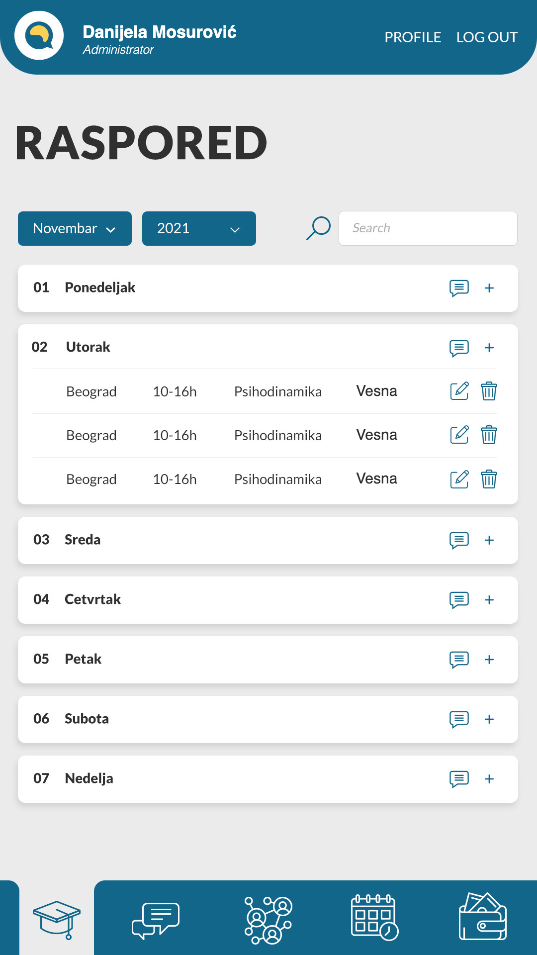
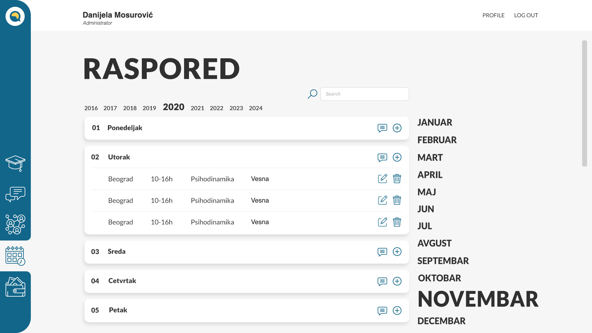 Schedule — year, month, day
02 — The money problem
Cash changed hands
before it reached
the books
Educators collected fees from trainees and forwarded them to the financial staff. On paper there was no dependable way to document who had paid and how much.
Money moved through the person teaching the session, which is where the record went missing. The fix was to record it at that exact moment instead of later.
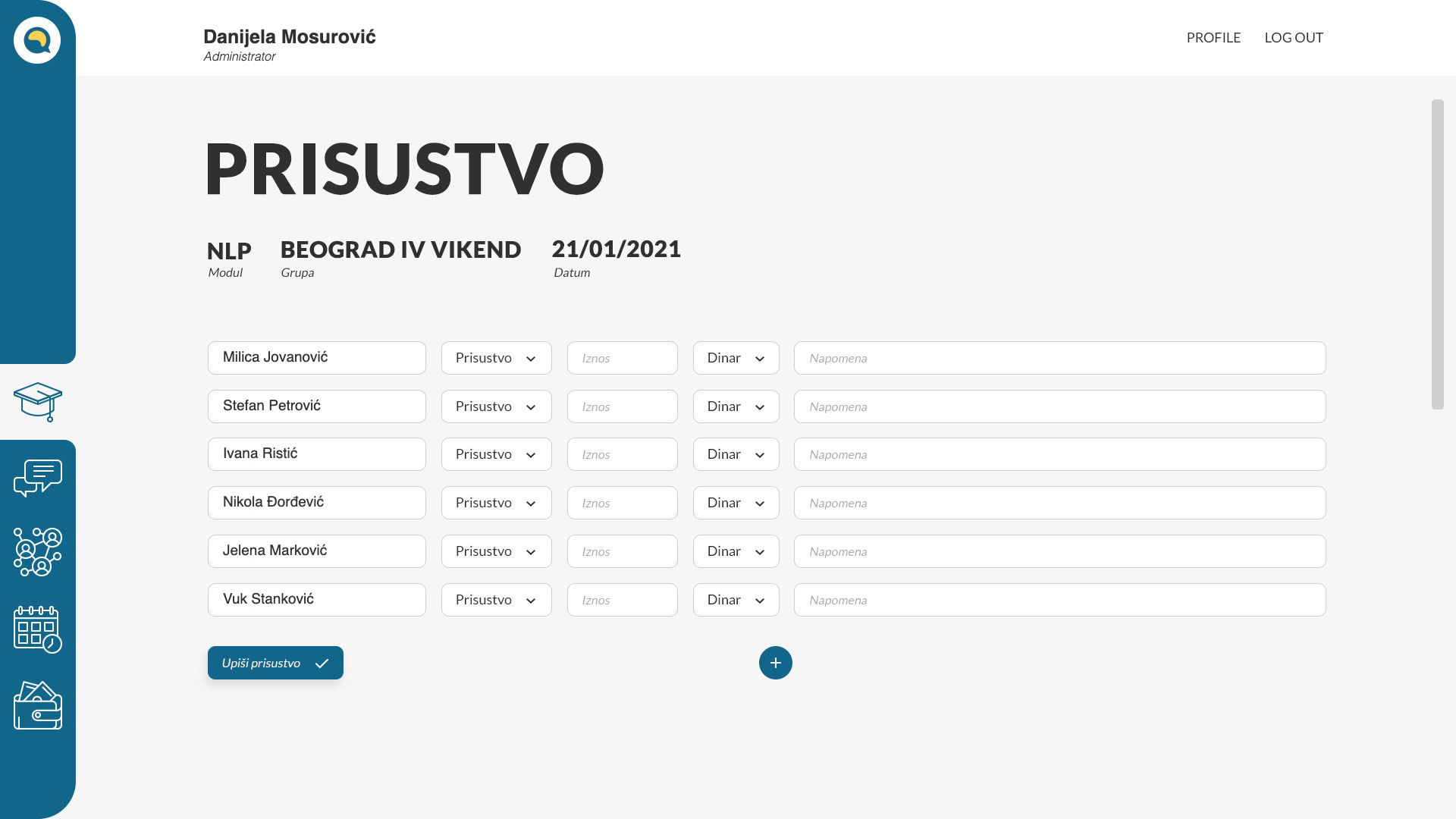
Attendance and payment,
one row each
The educator closes the session by going down the list once: who was present, how much they handed over, in which currency, and a note. Presence and payment are the same act in the room, so they are the same act on screen.
A note field
that earns its place
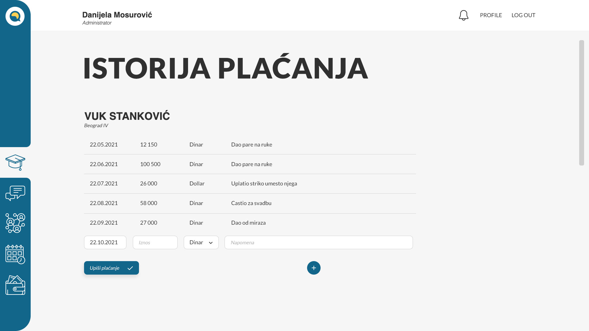
Every trainee has a payment ledger: date, amount, currency, note. Dinar, euro and dollar sit in the same list, because that is how the money actually arrives.
The note is the part the team asked for hardest. Real payments come with circumstances — handed over in cash, paid by a relative instead, settled late. On paper those explanations lived in someone's memory. Here they stay attached to the amount.
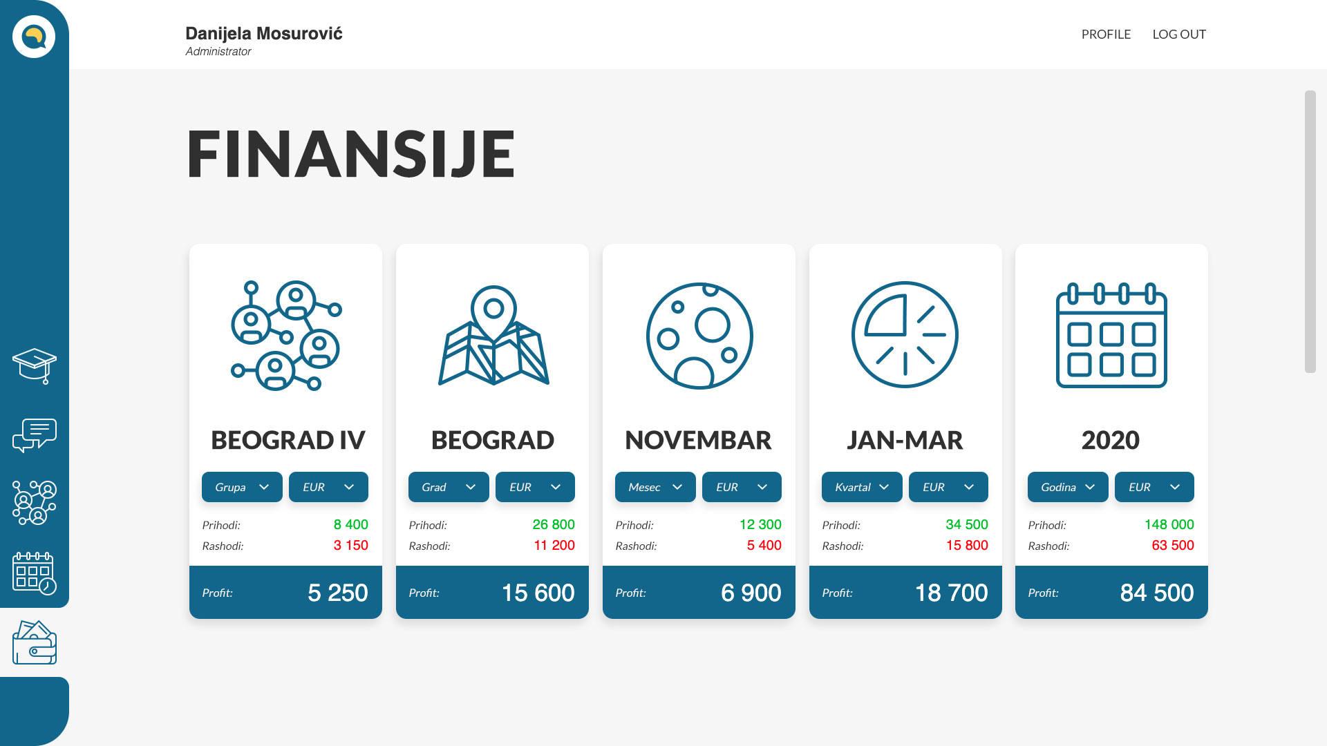
The whole picture,
five ways
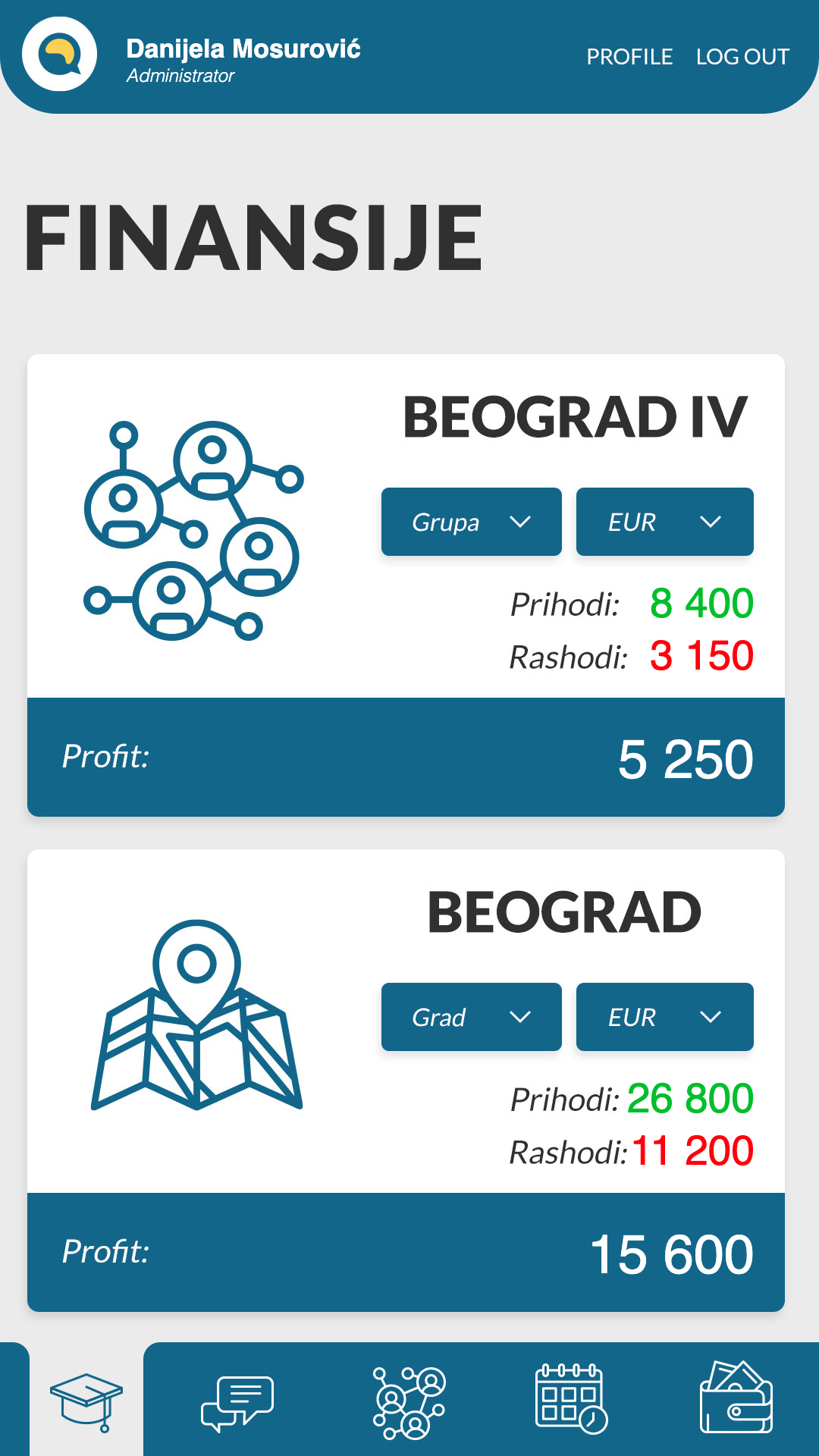
Once every payment is captured where it happens, the overseer's view is just a matter of grouping. Income, expenses and profit by group, by city, by month, by quarter and by year — each card with its own currency switch, so the same figures can be read in dinar or euro without a calculator.
03 — One person, one page
Everything about
one trainee
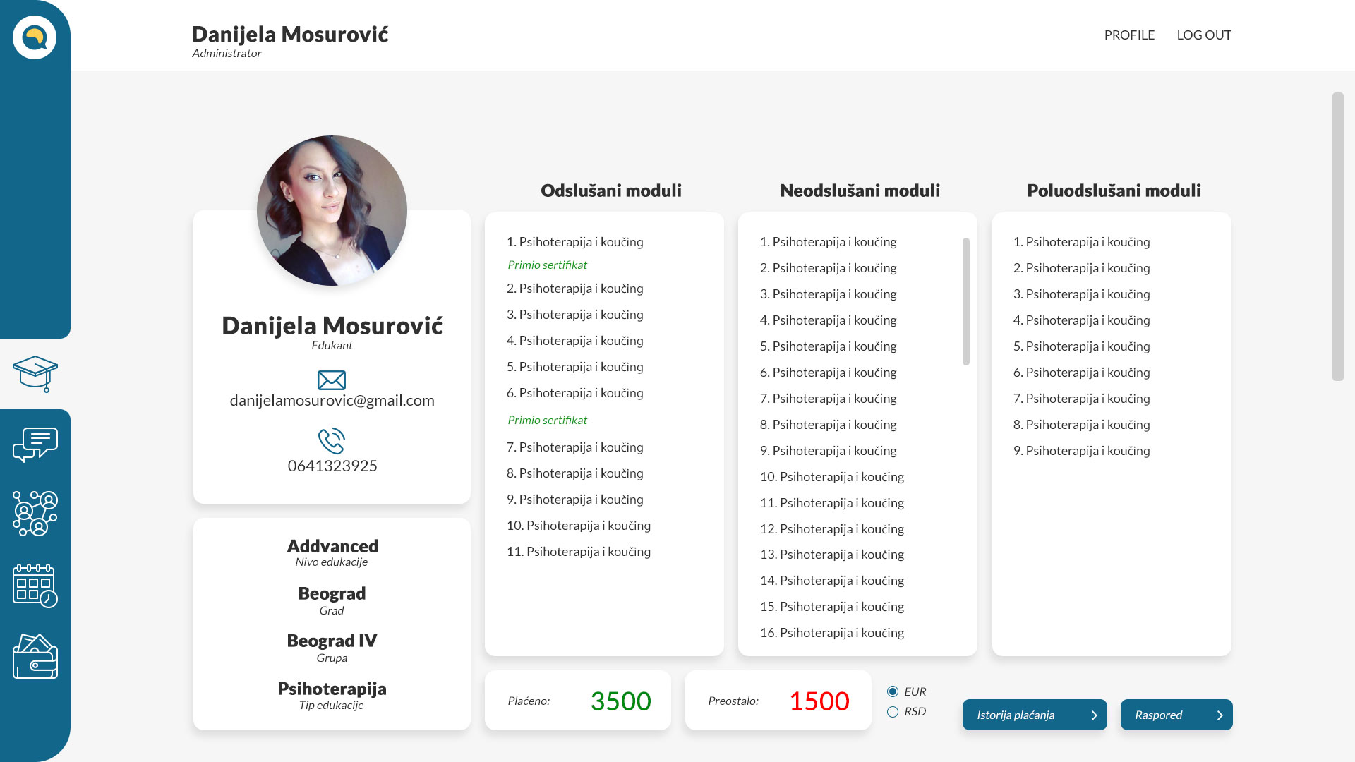
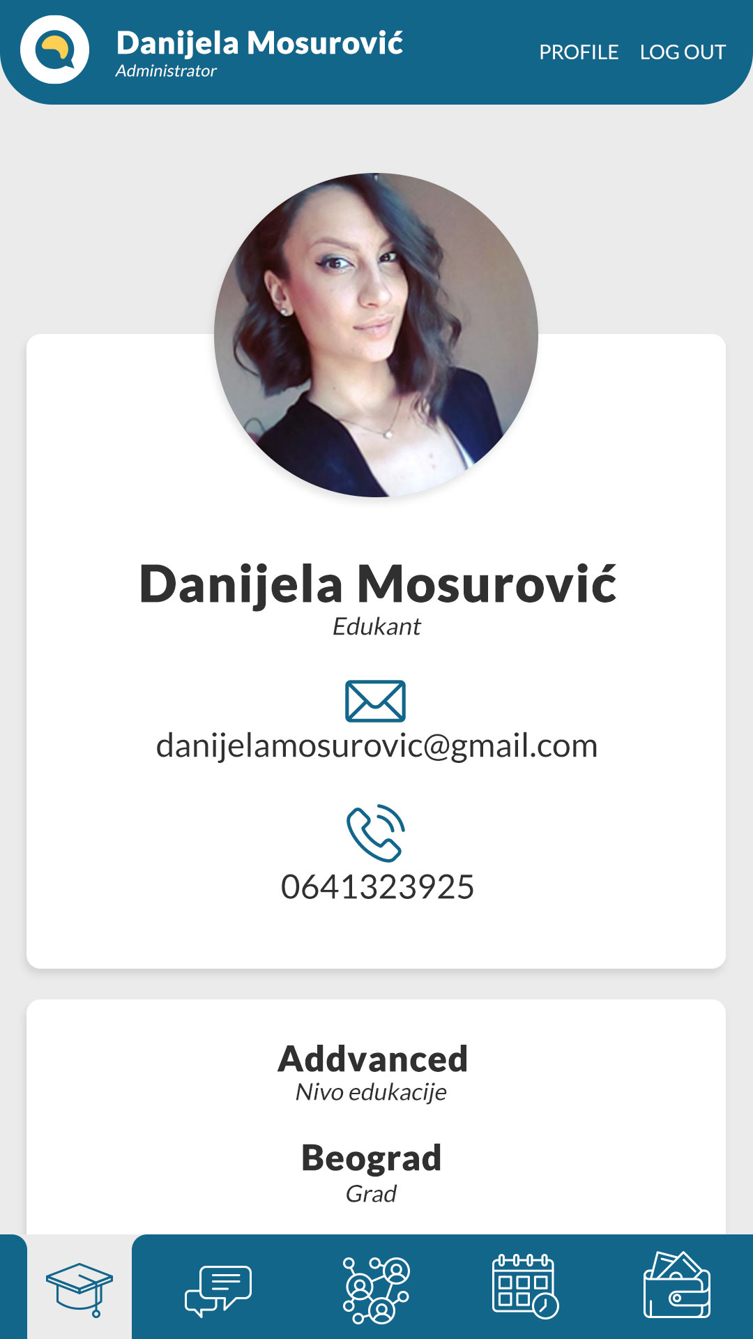
A trainee's progress is not a percentage. Modules split three ways — attended, not attended, partially attended — and certificates are marked inside the attended list where they were earned. Underneath sits the only other thing anyone needs to know: paid, and remaining.
04 — On the phone
Educators are not
at a desk
Sessions happen in rooms, not offices, so every administrator screen has a phone version. The desktop icon rail becomes a bottom tab bar. Table rows become cards that expand to show what the columns used to hold. The finance cards stack and grow instead of shrinking to fit.
OLI Centar
UX & UI design — built, launching