Performance
Overview
A dashboard for energy production and losses at a wind energy company. The design already existed and was already built. I was brought in to add what was missing.
Every number, label and chart on these screens is dummy data or lorem ipsum. I am not allowed to show the real content.
The tool
Inherited, then
changed
I was handed the Figma files with the existing screens. New dropdowns and new information had already been added to the filter, and more were planned.
I changed what I saw needed changing as I added the parts the app was missing.
01 — What was wrong
Nowhere left
to put anything
Two problems, and both of them were about space.
It sat across the top and had no room to grow. Every dropdown added to it pushed the rest of the screen further down, and more fields were already planned.
There was no space left to add one. Some need the whole area to be readable at all — the sunburst goes five levels deep and was already being squeezed.
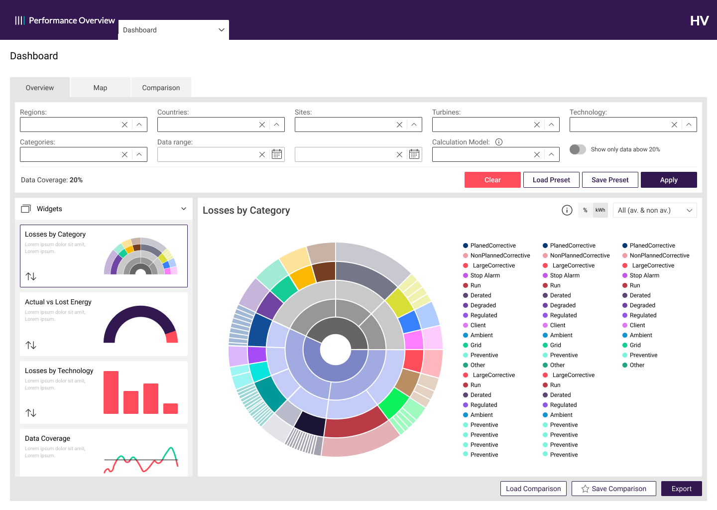 no room to grow
widget selection is unnecessarily large
no room to grow
widget selection is unnecessarily large
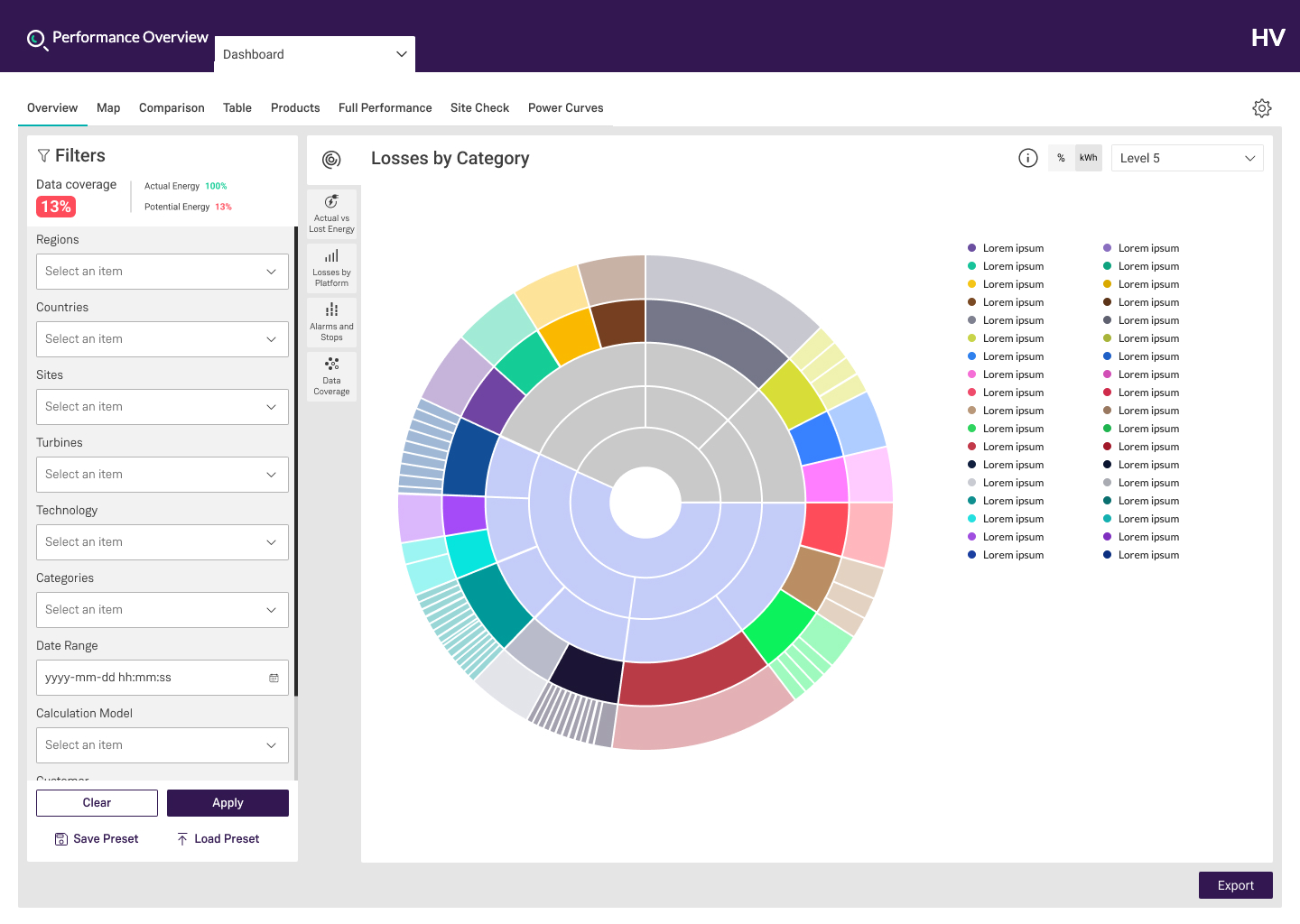
02 — The rest of the rail
Five widgets, same space
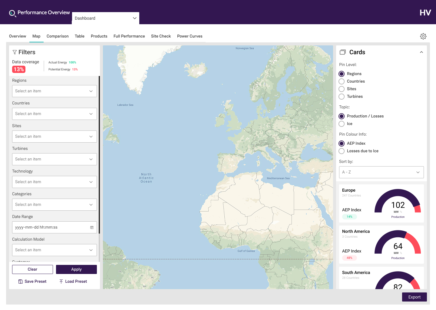
03 — The map
Everything
fits
The map keeps the same filter and gains a card panel on the right. Whatever gets added to the filter from here on is no longer taken out of the map.