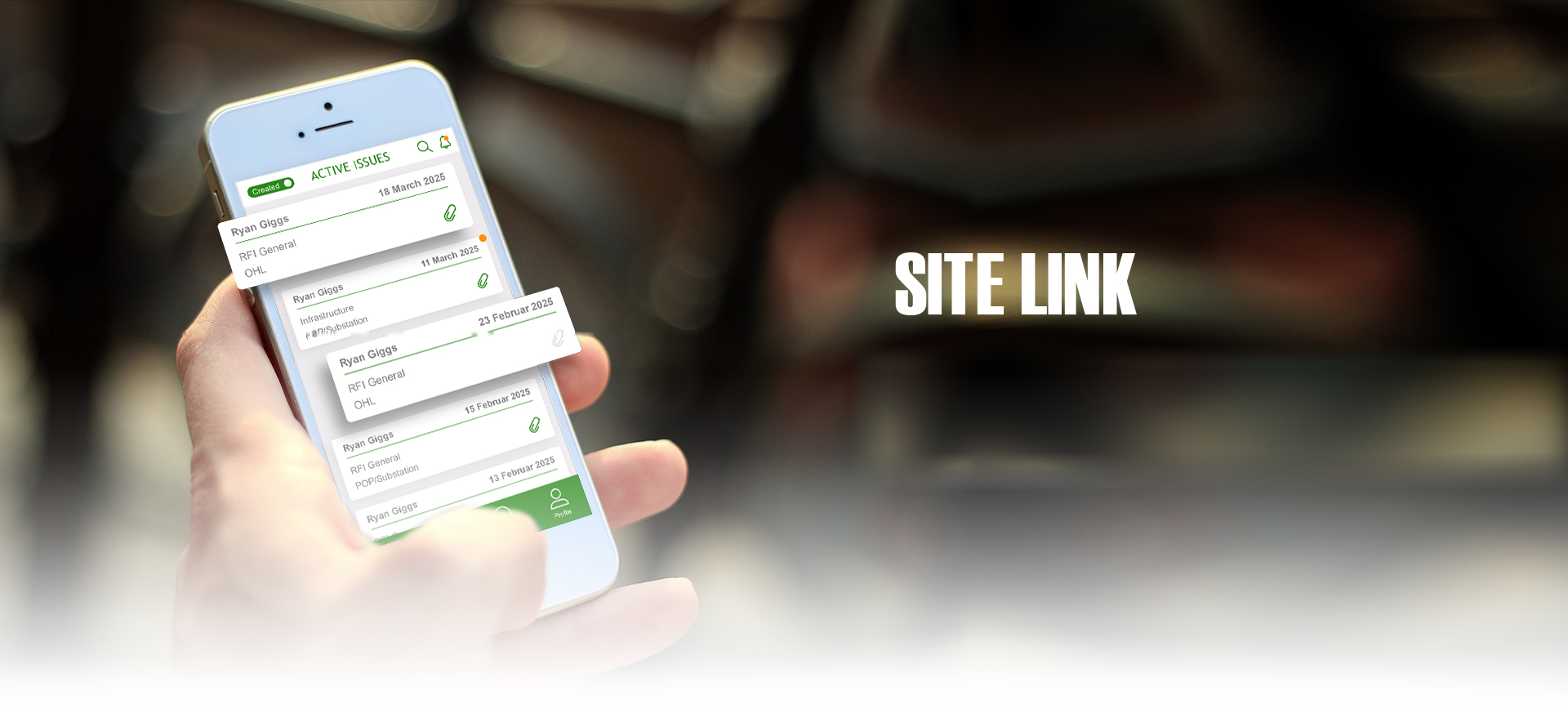
A company doing network infrastructure work on site needed one place to follow a task from start to finish. One person raises the issue, puts everything into it, and tags whoever has to resolve it.
01
Raising an issue takes
one pass down the screen
Fill, scroll, tag, send. One column, one width, pickers that all behave the same way.
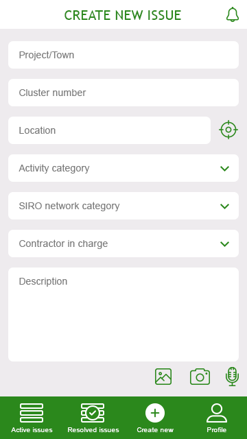 The form
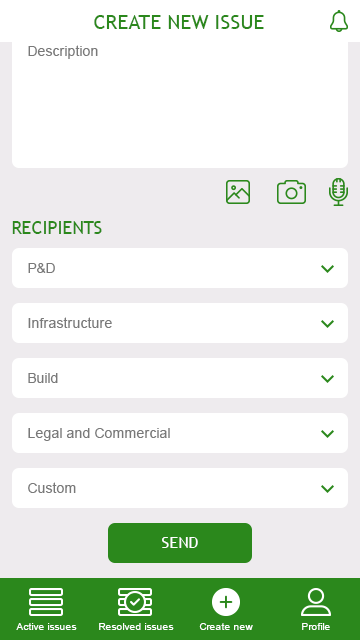 Tag the department
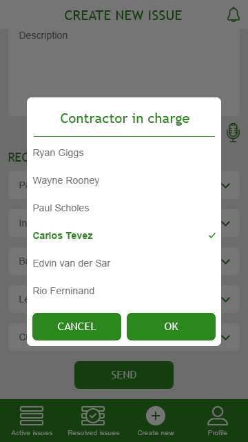 Pick the person
02
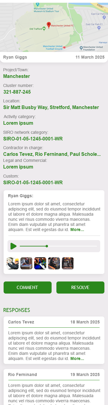
The crew opens it
once and has the
whole job
Where it is, what was asked, the photos, the voice note, every answer so far. Nothing sits on a second screen.
Comment and Resolve are the only two decisions the page asks for, and they sit right above the replies.


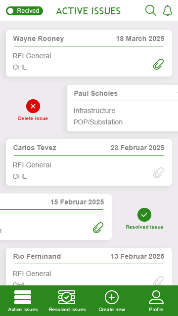 Swipe to close
03
Resolved means
closed for good
Only the person who raised it can comment, once, and only they can close it. After that the screens come back read only — same layout, actions gone.
04
They had no logo,
so I made them one
Two links of chain, each one half a speech bubble — the site and the office, joined. It set the green the whole interface runs on.
It wasn't part of the job. I drew it for them for free.