
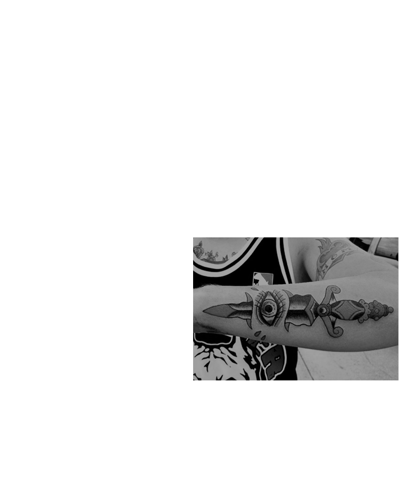
First step
Inspiration
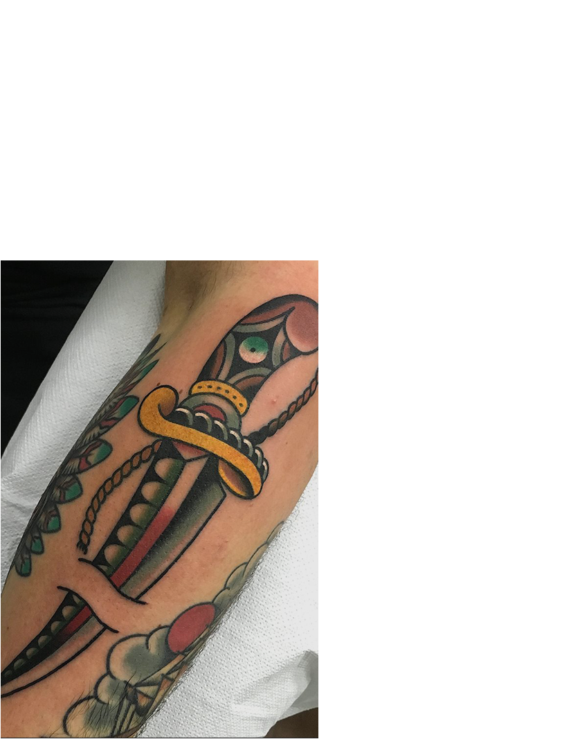
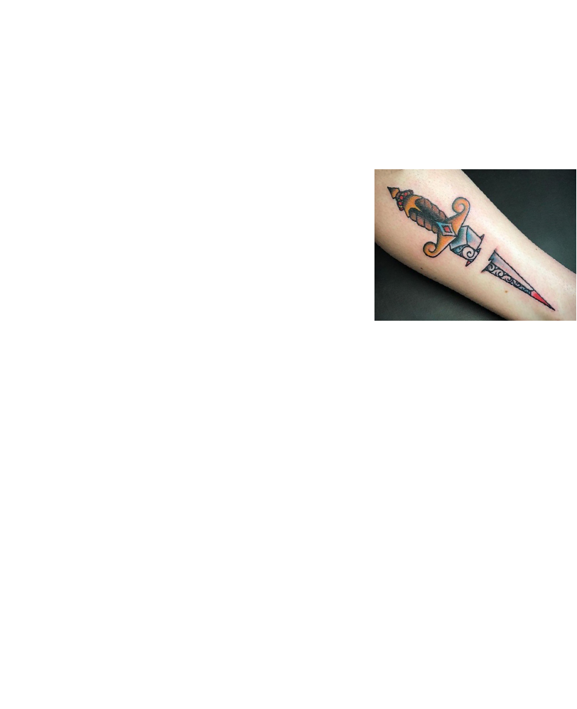
The first and hardest step of this project was inspiration — deciding which motif should become the Under Skin logo. The idea came from a tattoo motif that recurs constantly in the tattoo world: a dagger piercing the skin. That single motif carries both the brand name, “Under Skin”, and the craft itself.
Logo design
The second challenge was to execute the idea: sketch it out and build the logo from those sketches. To move the thought out of my head and onto paper, and give it meaning, value, life.

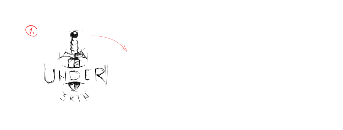

 Sketch
Vector
Final
Sketch
Vector
Final
Third step
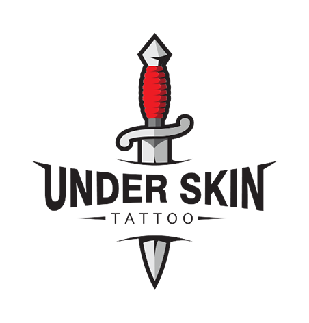
Finished logo
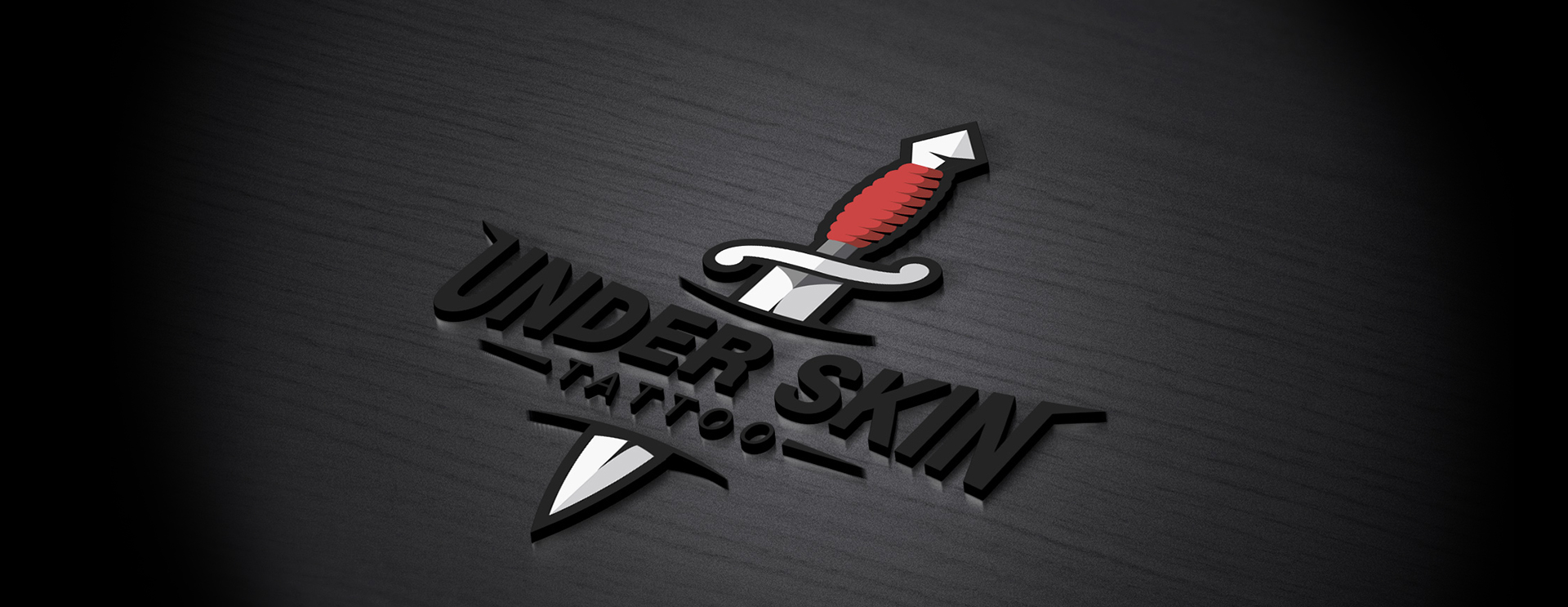
In the end, the finished logo has everything it should. The brand name is clearly legible, the trade is stated, and the mark itself represents that trade. It is very restrained, with few pronounced details, which keeps it readable at small sizes and easy to apply across marketing.
Fourth step
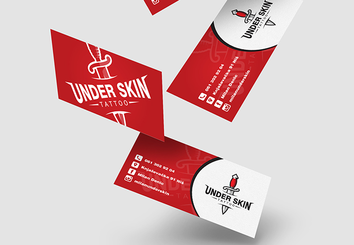
Promotional material
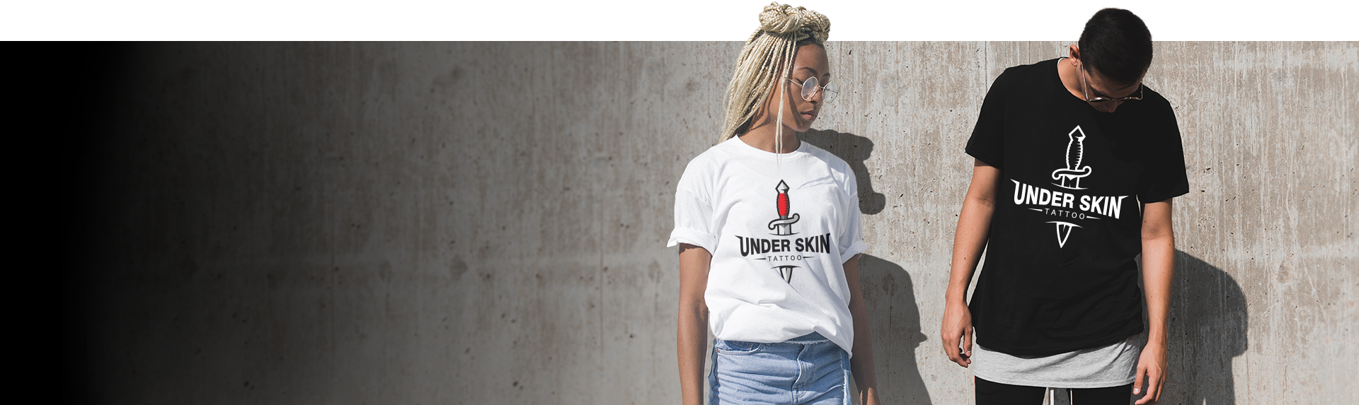
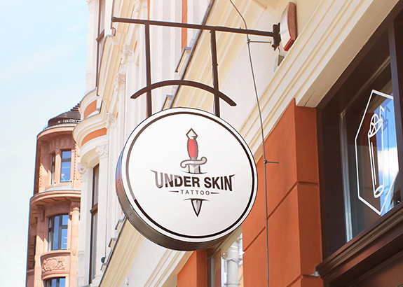
The whole marketing campaign revolves around the logo. The logo sits at the centre of every graphic, whether it is a T-shirt, a business card or a banner. It, together with the colours used in the mark, is what holds everything together as one piece.