Logo & Visual Identity
UPSKS
Udruženje za psihoterapiju, savetovanje i koučing Srbije — the Association for Psychotherapy, Counseling and Coaching of Serbia.
There was no brief. No positioning, no wording, no adjectives. One thing arrived from the client: a photograph of a tree with its root system exposed. That was the whole direction.
Sole designer. Logo only — the mark, the two lockups and the reduced versions.
 Supplied by the client — the only direction given
01 — Why a brain
A tree was
not enough
A tree with roots says growth and grounding, and that is where most identities in this field stop. It does not say what the association actually does.
Psychotherapy, counseling and coaching — all three have to do with changes people need to make in their heads. The brain was the thing that connected all three words.
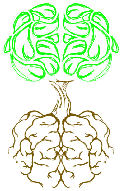
So the tree stayed, and the brain went into it. The first sketch drew both ends as hemispheres: a canopy split down the middle, and a root mass mirroring it below the trunk.
02 — Building the mark
Three things,
one shape
The canopy is not a brain with leaf texture on it. It is built out of leaves, each one shaped and turned until the group falls into the folds of a brain. Read fast it is foliage; read slowly it is a cortex.

03 — The version that went
Half the idea
had to go
The first version carried the sketch through to the end: brain above, brain below. It was symmetrical, it was consistent, and it was too much.
The client did not like the roots — too threatening, in their words. I agreed. Doubling the brain read as anatomy rather than as a tree, and at small sizes the root mass closed into a knot. The canopy stayed. The roots were redrawn as roots.
The type was replaced in the same pass. The first version set the name in a wide geometric sans that spread the acronym out and pushed the mark off to the side. The final one uses a condensed face instead: narrower letters, taller caps, so five letters sit directly under the trunk and the full name folds into three tidy lines beside it.
04 — Lockups
Five letters,
or all of them
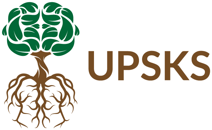
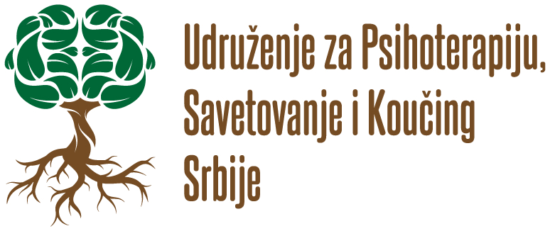
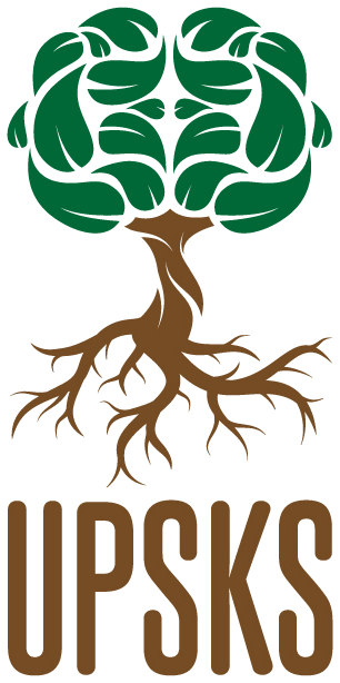
The name is nine words long, so the acronym does most of the work. Stacked under the mark it stays compact enough for a stamp, a badge or a profile picture. The full name gets the horizontal lockup instead, set narrow over three lines beside the mark, for anywhere the association still has to say what it is.
05 — One colour, and none
Green and brown
are optional
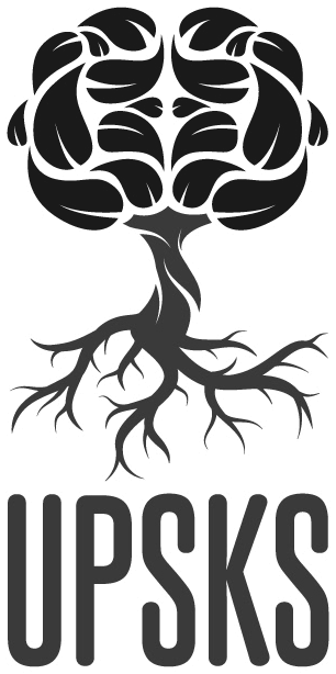
The colour split does a lot of the explaining: green where the leaves are, brown where the wood is. So the mark had to be checked without it. Flattened to one colour the canopy still reads as a brain, because the gaps between the leaves are cut wide enough to survive.
Udruženje za psihoterapiju,
savetovanje i koučing Srbije
Logo & visual identity